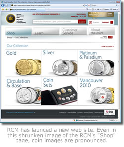
 The Royal Canadian Mint launched a new web site visitors are sure to appreciate. The Mint’s old Flash-based site was great for challenging the collector’s patience due to its slowness and difficulty in tracking down coins. The new site does away with those negatives, and adds much more.
The new design highlights the quantity and attractiveness of Mint coins far better than the old. Most enjoyable are the greatly improved coin image sizes and the smart navigational layout.
For an example, clicking on the web site’s "Shop" tab launches the differing types of coins the Mint sales — gold, silver, platinum & palladium, etc.
From there, selecting a coin type results in a two column display of the various coins, with large images the focus of attention. The collector can easily spot and then drill down further to view an even larger coin image while reading its description and specifications.
The new search feature found in the top-center works much the same way. Enter a coin type, click "Search" and, again, nicely sized coin images with descriptions and prices are listed. What use to take many minutes to find now takes seconds.
Also, it was nearly impossible to send a friend directly to a certain coin page since the old Flash nature of the site kept the URL address general. Now it is easy to send anyone directly to any page.
Kudos to the Mint’s web site design and implementation team. They have delivered a far superior web site that is well suited for visitors, and much, much faster. This collector will no longer dread visiting mint.ca, but will stop by often for opportunities to buy!


