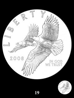
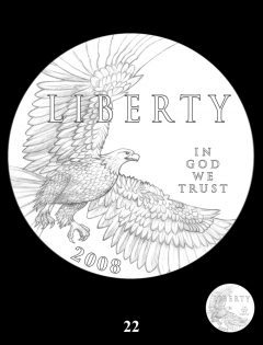
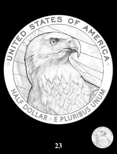
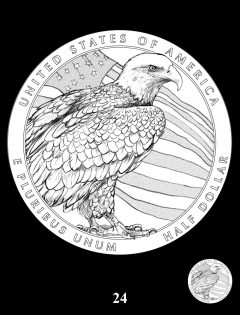
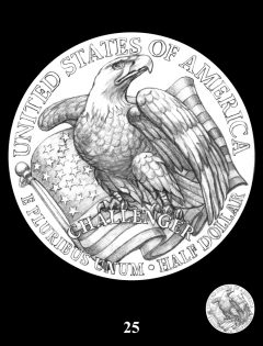
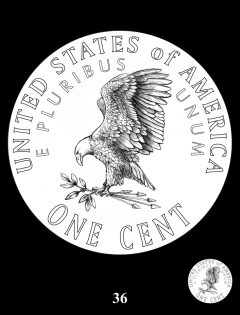
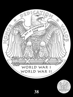
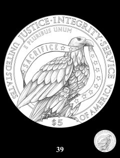
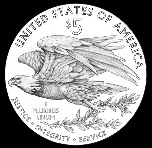
Today, April 8, the Citizens Coinage Advisory Committee (CCAC) recommended a replacement design for the reverse of American Silver Eagles, the U.S. Mint’s flagship product and the world’s most sought coin with sales this year on pace to hurdle 50 million.
Produced in bullion and numismatic formats, the 99.9% fine silver coins have featured the same designs since introduced in 1986 — Weinman’s Walking Liberty design on the obverse and Mercanti’s Heraldic Eagle design on the reverse.
With the popularity of bullion American Silver Eagles only increasing in recent years, any proposed changes will undergo extreme scrutiny. In the nearly two-hour teleconference meeting today to discuss new designs, one CCAC member recalled the disaster when the Coca-Cola Company replaced its original Coke formula and introduced "New Coke." It was clear that all committee members were very aware of the weight of the discussion.
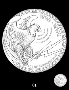
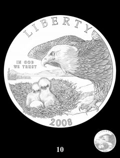
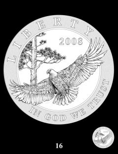
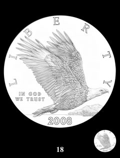
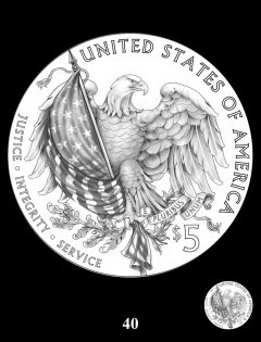
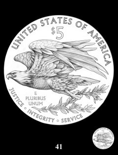
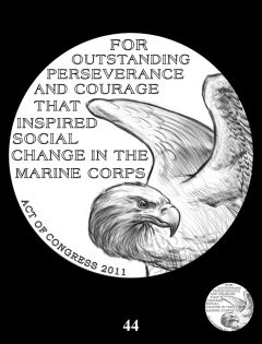
Opinions varied with members voicing exceptionally articulate positions. In the end, a vote was cast and one design leapt ahead of the others. Forty-four eagle designs in all were considered, each distinctive candidates and unused from past coin programs. Sixteen were selected by CCAC members before the meeting for further review. Using the 16, a discussion commenced and a vote was taken. The winning design, shown above, was originally considered for the reverse of the 2015 $5 U.S. Marshals Service Gold Commemorative Coins. It is this design, with some changes, that is proposed for reverses of collectible and bullion American Silver Eagles.
The next stage of the process now kicks off. The CCAC recommended that the U.S. Mint create several different versions of the selected design. All will include inscriptions already on American Silver Eagles. Further suggested renditions include an eagle without an olive branch, one with an olive branch and arrows to offer a recognized extension from the Mercanti design, a change to give the beak further separation from the edge, and adjusting the rotation to show the eagle slightly rising in flight.
These renditions will come before the CCAC for another round of discussion and then move to the Commission of Fine Arts (CFA) for review. From there, the Treasury Secretary has the last say. He can decide to stay with the current design or select one of the recommended ones.
CoinNews.net will publish another article that includes more details about the selection process. Below are images of all 16 candidate designs. Each may be enlarged with a click.
I like it!
No.41 looks to similar to the new Australia Wedge Tail Eagle design by John Mercanti.
The eagle looks like the reverse of the 1836 to 1839 Gobrecht dollars.
time to change ! also think it might need add a chip for anti-counterfeit or something like Canadian Gold Coin (2014) with micro laser print
In business there’s a saying “If it aint broke, don’t try to fix it!”
Where in God’s world did this stupid idea come from ? The CCAC has come to the conclusion that their purpose in life is to change whatever the want to change.
The current design is fantastic! and will be as long as they keep it. Leave it alone.
I think “It’s time” to replace the CCAC.
I kinda agree with Rob on not changing the design. They could offer another design as a special set like they have been doing with the American silver dollar sets. But the true American silver eagle should always stay the same.
i like 3 of them the nunber 41,22,16. i think it should be an EAGLE with stretched wings ,number 19 would work with one Eagle
One, what a terrible idea and two, what awful attempts. What is with all the value changes? Half dollars, five dollars?
Like Rob says, “if it ain’t broke, don’t fix it”.
SAVE THE AMERICAN EAGLE!
The CCAC and CFA have gone off the rails. I am just surprised that they didn’t recommend 3 eagles on the reverse….
What prompted this maelstrom of activity? What is the basis for the recommendation? Is it change for change sake? Answer to these 3 questions , anyone? But, if I were to select an image, #40, with modifications, is my choice. Like I have a say!?! And wouldn’t that be different, a poll open to the public to vote on their choice! Unique idea that will probably never encounter the light of day! I believe that each and every American Eagle carries the spirit of my fallen Brothers; living testament to those who made the ultimate sacrifice in defence of freedom.… Read more »
#40 looks pretty tough. I have a suggestion for the ccac. Why don’t you follow the britannia coinage and change the coin once in a while and then go back to the standard design. Put strict limits of per say 100000 max mintage on the coin like the british mint does. Coins being minted today are a puppy mill it seems. There are just too many and it is ruining the fun of coin collecting not to mention confusing.
Hopefully the Treasury Secretary will keep a cool head and decide to stay with the current design and not change just for change’s sake.
I must admit though, that I don’t really look at the reverse of the coin since the obverse is so much more attractive and beautiful. A new reverse isn’t going to change that any. The gold eagle reverse is the one that is really in need of redesign.
Agree with Iron Horse, leave it be. There are plenty of other venue for three headed snakes, maple trees, log cabins, and other birds posing on the beach. As for the other side I just thank the stars above that we don’t have the Queen E and her clan on everything.
I think it should be changed. I like #40 as well.
My favorites are by far #22 – that one is awesome, would like to see a little more pronounced relief on it – and #40 is very good too!
The rest are kind of overdone.
Is #01 giving off a WiFi signal? lol
The current Silver Eagle reverse is great as it is. Stars representing the original 13 states, olive branch & arrows is still very appropriate. My vote is leaNE.
I don’t think they can use the word ‘JUSTICE’ until we see a lot more rich bankers in prison.
I think we can use a change. Things are kind of boring at the U.S. Mint. I love the style of this eagle… Go for it!!!!!!!!!!!!!!!!!!!1
I personally don’t like it. Who are these people? #40 gets my vote but its probably too offensive to the academia types at CCAC.
I definitely would welcome the change. I have plenty of Silver Eagles with the old design. I also don’t feel the current reverse design ever came close to the beauty of the obverse.
I agree with TJ that #40 is far better
Didn’t anyone read the article? These designs are unused proposals from previous commemorative programs, evidently primarily the Bald Eagle coins, the U. S. Marshal Service program, and some of the recent military commemorative programs. The denomination and legends will all be modified to reflect the current inscriptions on the reverse of the silver bullion coin. In my opinion, it’s time for a change after all of the years of one design, and the proposed eagle is forceful and artistically executed.
These are awesome designs.. Number 40 would be amazing for a new silver eagle coin!! please do this!!
I really like #25…that is just what I like, kind of a design from the past.
Over the last several years there has seemed to be an agenda to get the citizenry used to ever changing currency designs. The cover story is ‘to thwart counterfeiting.’ One day we will know the real reason.
Silver is silver, what they need is anti-counterfeit, Too many fake eagle coins @ market, 🙁
Cannot wait to get this beauty!!!
I too like the Walking Liberty Silver Eagle. I wouldn’t mind some diversity to celebrate, let’s say as a 4th of July Commemorative, but some of these designs are just too commercial and Christ, 39 looks like a damn Pigeon, Really ! I like 16 a lot, but why not color it. Have the sky back ground proof silver, the tree trunk gold overlay with dark green needles, and the eagle its native mature rendition, but not in those cheesy appliqué’s, real enamel.
I agree, I like this one too. I think my choice would be a toss-up between this one and pattern 25. Though, my true opinion would be NOT to change the masterpiece that exists, if it has to change, you got my puny insignificant approval!
I would love to see #41 in high relief and #16 in reverse proof. Very nice illustrations.
I kind of like most of them. I favor keeping the current Eagle as the standard and then minting limited editions of several other coins over time for collections. Just the anticipation of new editions make the juices run!
they are beautiful the way they are , it will make them look like a silver round from China
I 100% agree with Henry. You can keep the original look, and then make newer or different designs, and keep them limited. Being very limited would increase the value as well as the excitement of collecting them !!!!!
I would like to see #25 for the obverse, and #40 being the reverse !!!!!!! WHAT AN AWESOME COIN THAT WOULD BE !!!! Proof and Ultra cameo……… also reverse proof !!!!
I hope the US Mint leaves the Silver Eagles with the current design. However, If a change is needed, I like the eagle design on the Walking Liberty Half Dollar. I know it would need some modification but it looks good. I don’t like mixing the design of a US Flag and Eagle. Two together is to much. Need only one theme.
I don’t think we need to be reminded of our wars, except ww1, ww11, & Korean. The rest were started by corrupt corporations and politicians. Leave the coin alone. As for justice, integrity, and service. We need to change the government “not the coin”. I honor, all my fallen brothers and sisters!!
SEMPER FI
@ Viet Vet: Read Doctor J above…The WORDS will be changed…
I like 40 too….
I’m all good for the change with the one they selected. Sorry. I’ve hated the current one for the longest time. First because it only has $1 dollar value on it. Come on? It ought to be at least $5 with silver’s true value($100 and up), even if the dollar were to be revalued. 2nd, because the current one is loaded with pagan symbols and meaning. Little to do with liberty or our republic. And lastly, the proposed sculpture would be more fitting with the walking liberty if we ratain her. It will also add to the collector value for… Read more »
I just love the idea. You’ll make them all the more collectible with a new design and probably spark renewed interest.
My favorites are 16, 18, 40 and 41 but especially 40.
Think I like some of them but
want the real United State
Eagle to stay the same on
Silver Dollars.
Hi , I see some nice Eagle,s with open Wings . No# 25 ,,,,40′,,, I think that they have a Strong Look ? But Still !!! Leave the coin alone, And yes 25 ,,,,, 40 Would be nice on a Special Coin Perhaps,,, Like this year ? Because of the 100 th Anaversary . But as you well know They are not thinking of changing the $1.00 Dallor Silver Eagle ? It is the special yearly Silver Coins . .? Some times the U,S Mint puts out to many special coins and kills the Value of the Coin . Or… Read more »
Who selected Miley Busiek to design the reverse side of the 1986 Gold America Eagle.
Why “Challenger” on 25? Other than that, it looks good..