Candidate designs for the U.S. Mint’s 2015 High Relief Silver Medal will look very familiar if you’ve read our earlier article about the 2015 $75 High Relief Gold Coin and its designs. Both sets are nearly identical.

Medals lack the many required elements found on U.S. precious metals coins, like the denomination, fineness, weight, and mottoes of In God We Trust, United States of America, and E Pluribus Unum. As such, the 41 proposed silver medal designs have far fewer inscriptions than the 41 gold coin designs. Really, that’s the main difference between the two sets.
Before you ask, pricing, specifications and other production details have not been disclosed. It would save time and money if the medals used the same planchets as those for the one-ounce, .999 fine American Silver Eagle. But that’s not a given. Expect to wait awhile before these types of questions are answered since the designs are only in the review stage. With that said, it would be shocking to see either of the high reliefs for sale before this fall.
On Thursday, Jan. 22, the candidates shown below were given to the Commission of Fine Arts (CFA) to review. The Citizens Coinage Advisory Committee (CCAC) is next in line. The CCAC will comment on the proposals, vote and offer their recommendations on Tuesday, Jan. 27.
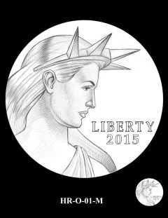
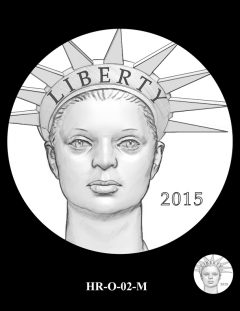
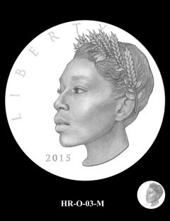
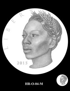
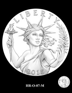
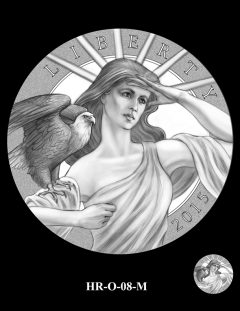
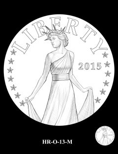
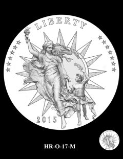
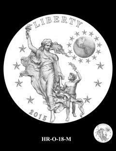
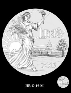
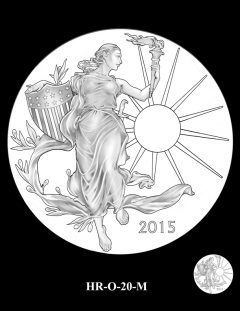
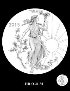
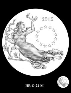
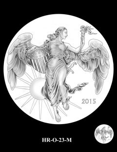
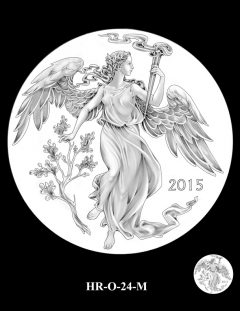
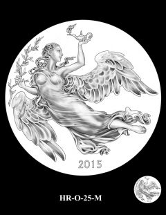
2015 High Relief Silver Medal, Obverse Design Candidate Images
Here are the 25 candidates for the silver medal obverse:
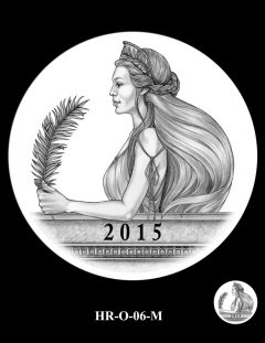
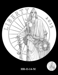
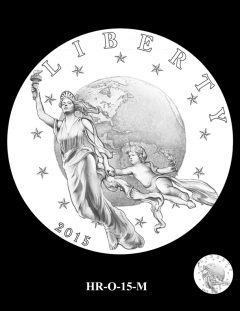
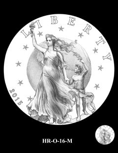
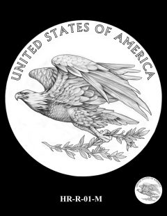
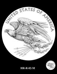
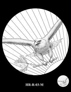
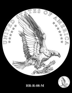
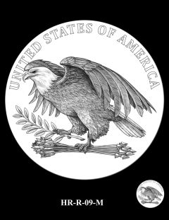
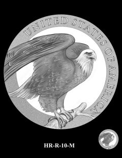
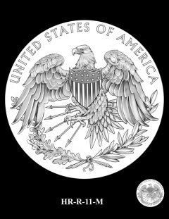
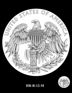
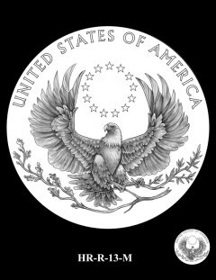
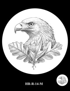
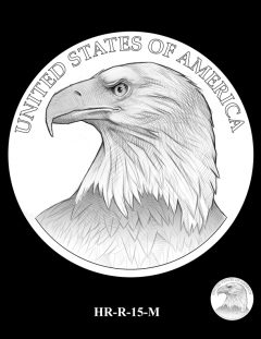
2015 High Relief Silver Medal, Reverse Design Candidate Images
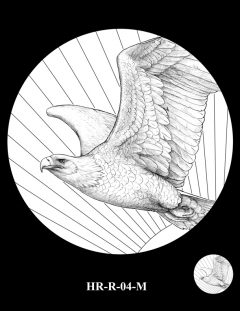
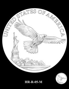
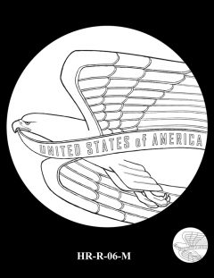
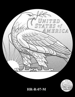
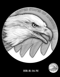
And here are the 16 candidates for the silver medal reverse:
CoinNews.net will follow-up with an overview of the CFA and CCAC recommendations.

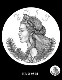
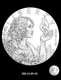
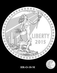
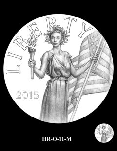
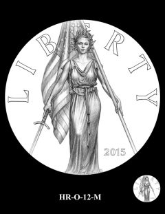


What’s up with the black chic?
We have sacagawea….I think Hispanic makes more sense with the flux of latin population explosion.
Or…roman nose, slant eyes, big lips, and high cheek bones.
O-20 M Obverse. R-11-M. I’ll buy if the art work is to my liking.I probably overlooked the mintage numbers
As I said on the post about the gold coin, many of these are quite beautiful, but what’s the point in issuing another (odd denomination) one plus a companion medal? Nothing is being commemorated here. They have even less meaning than the platinum issues, which at least as a series of bullion strikes had a logical theme across several years.
The O6 Reverse looks like something from the USPS dept ! LMAO
(Sorry for whoever drew that one) Nothing personal.
The examples range from the more traditional lady liberty to what I would refer to as art nouveau liberty.Who knows what the mints motive is,I for one would like to see change so here we have examples of style.Why not test the market mint a few thousand of the Nouveau and the same of the more traditional.Do a market test, give this minting a meaning.
It’s just Dep Dir Peterson trying to make his mark on the US Mint before he’s kicked out for ineptitude.
Mr Petersons position is political pushed and pulled by many to please a few.
The mint needs a total new face dump the commeratives and recyling of old ideas and get with programs that give the collector incentive like true value and economic growth.
I was hoping for the same design as 2009 high relief gold coin. It was beautiful!
What, our current designs are not good enough. The 2009 high relief gold coin was beautiful and classic. Depicting Liberty with wings (angel like)!!!! That taking our concept of Liberty just a little over the cliff. Just one of the many examples that can be pointed out.
The majority of the obverse designs do not show her as a strong guardian of our beliefs. Liberty, as depicted by Augustus Saint-Gaudens is considered one of the most beautiful and best designs and the US Mint wants to produce something less.