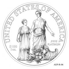
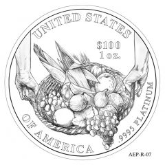
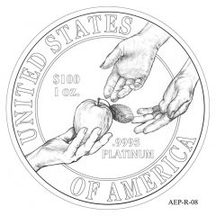
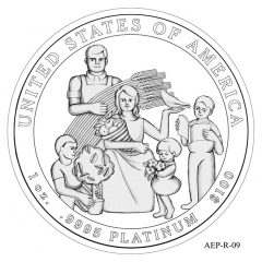
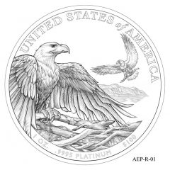
In July, the United States Mint will release the 2013-W Proof American Platinum Eagle. Nine design candidates for the reverse of this year’s platinum coin have already been reviewed.
Struck from one ounce of 99.95% and around since 1997, proof American Platinum Eagles feature annually changing reverses. Beginning in 2009, a six-year series was launched with reverse designs emblematic of the six principles found in the preamble of the U. S. Constitution. These design themes by year are:
2009 – To Form a More Perfect Union
2010 – To Establish Justice
2011 – To Insure Domestic Tranquility
2012 – To Provide for the Common Defense
2013 – To Promote the General Welfare
2014 – To Secure the Blessings of Liberty to Ourselves and our Posterity
The U.S. Mint had multiple designs created emblematic of this year’s "To Promote the General Welfare" theme. These design candidates have been reviewed by the Citizen’s Coinage Advisory Committee (CCAC) and the United States Commission of Fine Arts (CFA), the two bodies are tasked with reviewing designs for American coins and medals.
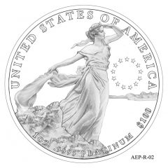
Of the nine design candidates, the Commission of Fine Arts recommended design candidate AEP-02:
"The Commission members expressed appreciation for including images of the recent issues of platinum eagle coins in the presentation; they recommended alternative #2 as the most appropriate design when considered with the previous coins of the series. Consistent with their continuing preference for simplicity in the design of coins and medals, they recommended removal of the horizon line and the ring of stars from the right side of the composition."
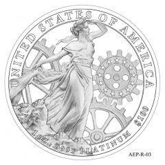
As for Citizen’s Coinage Advisory Committee, members preferred AEP-03:
"The Committee strongly recommended design AEP-03 showing "Young America" symbolized in the form of an elegant young woman contrasted against images of interlocking gears emblematic of the unique workings of the state and federal governments of the United States in promoting the general welfare of the nation. The design garnered 28 of the 30 possible points through the Committee’s scoring process. Members commented on the well balanced composition of the design, the successful balance of image and negative space and that it would create a beautiful and fitting image for the reverse of the coin."
The final selection for the 2013-W Proof American Platinum Eagle will be announced before its July release.
2013 American Platinum Eagle Design Candidates
All of the candidate designs are below. Any of the images may be enlarged with a click.
I go with the Commission of Fine Arts choice with their modification though I’m not sure how that symbolizes To Promote the General Welfare (whatever that means).
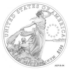
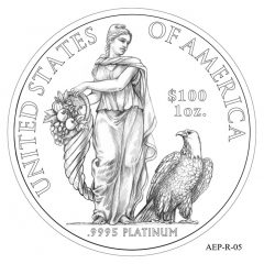
These designs are all aesthetically horrific. They are either Socialist Realism or outright melodramatic camp. I mean c’mon…Adam & Eve? Liberty and her pet eagle? The circular star motif of Europe? And why is that little Thor-guy stabbing Liberty in her thigh? The gears and bizarre Socialist workers family design are right from mid-20th century USSR….what gives? Aren’t there any talented artists willing to design for this coin?
I disagree a bit. I Love the AEP 2 and 3 design, craftsmanship and details (i will leave the simbolism out, up to taste and/or preferences), as for the rest of the designs, i agree. A bit childish I would even say.
With the theme “To Promote the General Welfare”, why didn’t they have an image of a morbidly obese mom with kids she can’t afford to pop out, all in line at the grocery, paying with general welfare food stamps? I read that food stamp recipients have increased to an all-time high. My taxes go to feed those (some worthy) on general welfare. So even though I own a business with forty employees, I can’t see plunking down major bucks for this coin. My extra money is already spent supporting others. And their general welfare. Just keepin it real.
Very dangerous standing next to gear works with a robe on. And where is her hard hat.
I love the rhetoric so let me expand on those taken. The little guy I think is suppose to be a sculptor with hammer and chisel, shaping Liberty. Many have complained in the past of lacking the detail of some of the great sculptors in the past, but there you have it with Lady Liberty in 02 & 3, which I love. However I do see the implication of socialist propaganda, but what do you expect from todays artist trained in our higher(?) learning socialist stigma centers. I love the Hard Hat idea, just put the sculptors hammer in Liberty’s… Read more »
I’m not sure I understand the promoting general welfare concept here either. Lately that seems to mean more like Robin Hood than actually helping people pick them selves up. Visually I think AEP-3 has too much going on in it – and I actually like the circle of stars in AEP-2 – this is supposed to go back to the foundation and the stars draws that correlation. I agree the rest of the designs were a waste of time, except the little chisler was fun.
They should of gone with the only design worthy of being on a coin – AEP-01… The eagle soaring high over head is a sign prosperity and good fortune for all. It’s to bad that these days the word means me giving up more of my hard earned money to the gov so they can dole it out to others. Other than the first one, these samples are pathetic. Sad. Embarrassing.
Remember folks this is the same mint that gave us a sufferget coin
the Phelps, Interesting calling the sculptor, “the little chiseler”, a term I haven’t heard for decades, meaning swindler, thief. It kind of fits the general acrimony displayed on this site. Sometimes I wonder if the Mint doesn’t go through a bit of acridity thinking they’re damned if they do and damned if they don’t.
I agree with the Commission of Fine art’s selection. I think the balance of blank space is a good contrast.
Lessons from the coin designs and the theme “To promote the general welfare”: 01. Eagles make their own nests. So should we, instead of being expected to feather the nests of others. 02. Who is going to bail me out next? 03. Oh THIS is a factory! I’ve heard of those. 04. So that’s where my cellulite dimples came from. 05. You can’t have my handout horn of plenty. 06. It’s fine, Dear, half of all Americans receive some kind of govt assistance. 07. Thank you, hardworking farmers. 08. Our children and grandchildren will sustain us after we bankrupt them.… Read more »
Ed – not sure what your comment means. But don’t forget the Alice Paul coin subject was mandated in the law by Congress whereas these designs are supposed to symbolize a nebulous principle which I think would take more than a picture’s 1,000 words to describe.
Jim, If it were truly nebulous (unclear or vague), then forget impression on the reverse, just a proof back ground with a simple phrase:
BUY ME
I’M WORTH IT
Of course if you really want a bankable investment in Platinum theirs(?) is an extra $1100 more and only 250 mintage.
You can’t blame me for making this political. I like the simplicity of 002. Liberty always promotes the general welfare as it improves and simplifies our lives. It has a classic feel and no clutter.
?? “The circular star motif of Europe” ??
I guess the Continental Congress borrowed it from the European Union back in 1777. It only took some time travel or a bit of remote viewing…
http://georgiainfo.galileo.usg.edu/usflag77.htm
In AEP-03 you have Lady Liberty with the meshed gears of industry so it’s more about that once great innovative spirit that America had. Producing the wealth that made America great, that made America the prosperous and self reliant nation that promoted the General Welfare through the jobs that industry created. So what’s Lady Liberty doing she’s looking for that once great creativity that has been outsourced to India, Malaysia, Mexico, and China. If this country doesn’t create it will starve on a service based economy that’s dependent on an inflated mass produced dollar that’s not worth 1/10 the paper… Read more »
Personally I’m getting tired of all the reminders of the original 13 stars. That’s why I side with the Commission of Fine Arts choice and their modification.
These preferred designs omit any eagle image or privy mark for a first in the entire series. I was under the impression that some sort of “eagle” was required.
These are design candidates, not the final product. You won’t find any W mint mark on these either and you can bet there’ll be one on the final product so they’ll probably sneak in a privy mark somewhere too.
AEP2, 3 and 4, looks like Liberty is standing on the edge of the slippery slope ready to slide off the cliff. Maybe a statement about our times?
Has a decision been made regarding which of the two reverses the U.S. Mint will use for next months release?