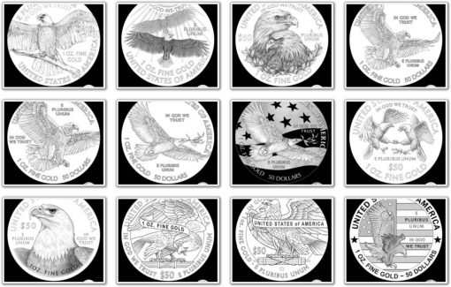
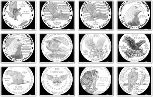
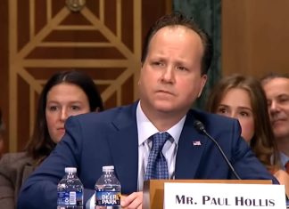
The United States Mint unveiled candidate designs to replace the imagery on reverses of American Eagle gold and silver coins.
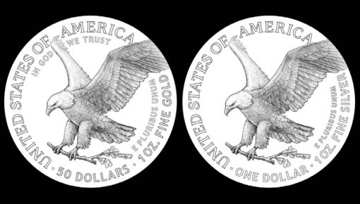
Introduced in 1986, the Mint’s program of American Eagle coins quickly achieved worldwide fame because of their beauty and guaranteed precious metal weight, content and purity. They have always featured their original designs except for the change in date for each year of their release.
The newly selected designs will be coupled with yet to be revealed anti-counterfeiting technology, appearing first on bullion editions in 2021 and follow sometime later on proof and uncirculated versions for collectors.
Thirty-Nine Candidate Designs
Thirty-nine pairings of the proposed reverse designs have been unveiled with one version for each type of coin. The Commission of Fine Arts (CFA) reviewed the designs on Thursday, June 18. The Citizens Coinage Advisory Committee (CCAC) will offer their recommendations on Tuesday, June 23. Each design depicts an eagle or eagles.
The following U.S. Mint line art images show the proposed reverse designs for the American Gold Eagle. Candidate designs for the American Silver Eagle are the same with exceptions of their inscribed face value, their precious metal content, and their lack of the "IN GOD WE TRUST" since this inscription already appears on the coin’s obverse side.
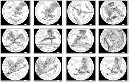
Pairings of all 39 candidate designs are published here.
If looking for five finalists…suggest 19A, 27, 27A, 28A and 33.
The eagle’s clipped left wing just doesn’t look right & the almost bare oak branch is simply unappealing. (Referring to the top two photos in this article).
NumisdudeTX
My bet is on the two eagles nestling (16). Done well, the feathers will be beautiful, and should look magnificent on a coin.
5 or 38
#35 would tie nicely to the 100th anniversary of the PEACE dollar. Especially since there does not appear to be much traction for a commemorative of the 1921 silver dollars. Hopefully the new design will be used for many years to come unlike the platinum and other designs that change annually.
33 has a really nice look with the eagle and the stars
The current Silver $1 Eagle is a classic design, timeless in its beauty. The designs of contemporary stylized eagles is a mismatch to the coin’s centuries-old theme of heraldic eagle emblems that have been around since President Washington threw one across the river. None of these designs are fitting to what the American Silver Dollar has been to America and the world. Save the modern twist to those American Liberty coins
absolutely! and all the designs with the eagle’s wing feathers clipped should be scrapped. an eagle’s wings should never be clipped.at least they didn’t go all pc on these designs(did they?)
I’m troubled by the departure from American coin’s past designs representing laurels OR arrows to laurels AND arrows PLUS America’s symbol having clipped wings. Nor do the bare branches represent growth and prosperity. These are very disappointing designs of America’s very important icons.
very observant.but if you look around this country today, America’s icons,symbols,and statues of the past are being destroyed whether they be good or bad.you shouldn’t expect anything different from the coin designers or the Mint.TROUBLING TIMES INDEED.
Totally agree
Agreed, why not employ a design based on the 1794 FLowing head $1 or 1795 Eagle ….. or from the great # of fantastic deigns from the past, seems like there are mostly teenagers & digital artisit making this stuff up, too ANTISEPTIC (no apologies C19!!)
Definitely 23, 33, or 34
The designs need more professional attention.
you think? Grade school stuff…..
I really like 31…but i would prefer the Peace dollars Eagle
Too bland and generic looking! Why dont they try instead of a design mocking the old platinum eagles, why don’t they try something different like an eagle about to clutch a snake on the ground? The flying eagle is too over worked and used,,, these choices are too close and too boring
Another thing they aren’t thinking,,, these designs will eat the dies alive.. They need to read the history of the standing liberty quarter and the backfire design it took on dies and wear and tear,, the cost alone to manufacture these designs will cost more than what the metal and labor costs! These are actually investment coins, and the numbers will be so low and horribly expensive!
This design will be produced in the millions for the bullion coin, lesser amounts for the proof and burnished. There may be less of the 70 grade coins and more in the mid to upper 60’s if the design is so complicated
#8 and #37 are particularly appealing. Only a few “definite NO’s” in the group.
I do not see why they want to change the reverse designs, maybe its so the U.S. mint can copyright them to prevent copying by other producers. If they must change them, please make sure each has its own design, not one they share as the baseball, moon landing and basketball coins do.
When it comes to the denomination I prefer that it be spelled out as on the classic coins: One Dollar, Fifty Dollars or 50 Dollars.
34 is perfect for the Gold, albeit it needs adjustments. The Eagle should be centered and that $50 should not be such a focal point, it needs to be smaller and below In God We Trust. There should also be a clear boundry between the Bordering and the Eagle, something similar to the Perth Swan design.
something about this design reminds me of the British “the Queens Beasts” series. the GRIFFIN!
That is true,the 1oz Proof Dragon was one great design. Try to find one of those, only 6000 made. I was lucky enough to get 2 when they first came out.
Subtle changes
When the Commission of Fine Arts and the Citizens Coinage Advisory Committee are involved — NOTHING good can result
I have to go with 31A, second choice would be 8A. Although knowing the mint they’ll pick the one nobody likes.
None of them are fitting for this coin! Stay with the current reverse design.
##25 & 36. I do not care for the one “they” prefer, which is what the USM & their people do, figure out which will be the least popular design & choose it. Likely up set they can’t add a PC component…..
I saw these today again, they really SUCK…. kinda like a draw by #s pic……where have all the artist gone???
Maybe some have gone to the Perth Mint, or private mints that don’t stifle creative, and aesthetic designs.
Former Chief Sculptor-Engraver of the U.S. Mint left and went to the Perth Mint Australia.& does projects… – John M. Mercanti.
NumisdudeTX
I like the Wedge-tailed Eagle series.
You can tell these were crafted by modern artists who think in 2D, primarily graphic design 2D. The great coin designs of the past were created by sculptors who were taught with how to work in a 3D medium. Until the US mint returns to using such artists, their coins (much like these proposed designs) will look pedestrian to ugly (just witness what they’ve done to the back of the standard quarter).
8, 31, 12 in that order. others seem very busy
Number 33 has my vote…very similar to the original design, yet maintaining the regal image of America on her coins.
Looks like they may have reached their enrollment limit before going on sale. Check the enrollments. All three silver eagles. Attached photo as reference.